I rebranded my favorite restaurant in West Hollywood (Craig’s) in one of my favorite design eras, the Polish School of Posters. I’m really passionate about expressing messages through design and wanted the message of “food” to show through images and typography. The contradiction of using animal skeletons on the dinner menu is used to provoke feeling in the guest.
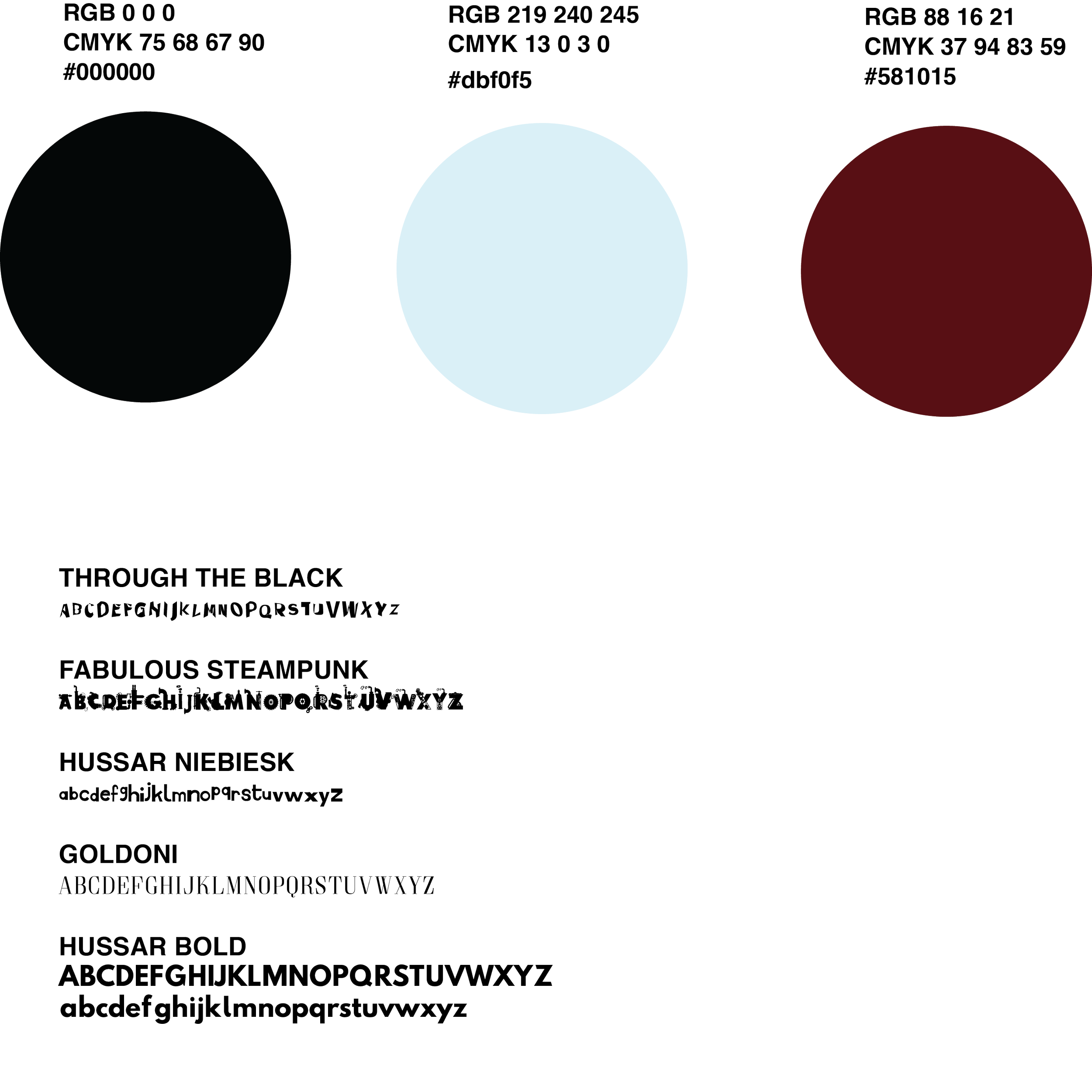
Problem: To rebrand an already existing dinner menu for celebrity hotspot restaurant “Craig’s” in the style of the Polish School of Posters.
Solution: I chose the Polish School of Posters for inspiration for the menu rebrand for two reasons: 1. I was very intrigued about this specific design style when learning about it. 2. I thought I could take the quirkiness of this design style and turn it into a clever oxymoron for the dinner menu by including the skeletons of animals to match each protein category. Some may see this as disturbing to put on a dinner menu, but the Polish School of Posters was iconic because of the ability to allow viewers to feel disturbed, creeped out, and intrigued.